
How to Write the Best Homepage for Your Small Business – With Awesome Examples
Struggling to write your small business homepage? Content marketing specialist Elise Moss is here to give you a hand. Below, she shows you why your homepage matters so much – and how to get it right.
Imagine this. You try to enter a store, but the front door is splintered in different places and held together by tape. Some of the windows have been replaced with cardboard, and there are three layers of dust over every surface.
What would you do in this situation? Probably walk out and go to a different store that looks ready for business.
Your homepage is like a storefront. It’s the thing that people see first when they come to your site, so it’s crucial to capture their attention positively. Thus, they’re more likely to stay, look around, and buy something.
In this post, we’re going to show you how you can take your homepage from bland to brilliant, so it nurtures more leads and wins more conversions for your business. We’ll also look at some examples of small businesses that have managed to get their homepage design just right.
Why you need a good homepage
Your homepage can make or break your business. A well-designed one will pull visitors in, tell them what steps to take next, and help them get to know your website better.
No matter what products or services you’re selling, your homepage has to serve two core purposes:
#1. To introduce potential customers to your business
Your homepage is people’s first interaction with your business. It’s an opportunity for you to acquaint them with your brand, products, and services. Your brand image, logo, values, tagline, purpose, and unique value proposition should be visible and memorable — like it is on ZeroBounce’s:
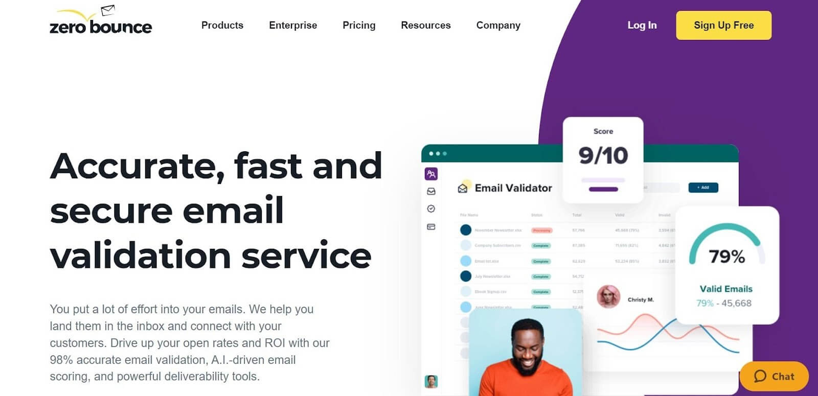
Your homepage gives people an idea of what you do, how you can improve their lives, and the problems you can solve for them. The better it communicates this information, the more effective you will be at attracting potential buyers and clients.
#2. To make sales
Beyond strengthening your brand identity and increasing awareness, you need the people who visit your website to actually buy your product or sign up for your service so you can stay in business and keep growing. The work of your homepage is to motivate them to convert and take an action that will push them closer to handing over their money.
When visitors are impressed by your website and the promise you’re making, they’re more likely to keep returning. While they may not patronize you right away, they will tell others about your business and come back when they’re finally ready to buy from you.
Similarly, if you want to grow your email marketing list, get people to download your app, or check out a free resource, a download link on your homepage is a surefire way to boost conversions.
What makes a homepage “great”
There are certain qualities that all great homepages possess that make them highly effective at capturing visitors’ attention and luring them to take a desired action. Here are five of them:
It clearly describes your business
The only companies that can get away with a vague homepage that doesn’t explain who they are, what they do, and how the visitor can benefit from their products or services are those that are already well-recognized. Think Apple, Pepsi, and Samsung.
As a small business, you need all the help you can get. If visitors can’t tell what your business is about within seconds of landing on your page, they won’t hang around for long. So don’t make them guess — put it all on there in clear and straightforward language.
Clean and creative design
Your homepage shouldn’t have too many things vying for visitors’ attention. Stick with a clean design that focuses on the critical areas of your ecommerce site and remove any unnecessary information.
Use vivid imagery that will resonate with viewers emotionally and help them connect with your brand. Don’t be afraid to introduce bold and creative twists to your homepage design to make your website more memorable.
Positive user experience
In a world with 4.32 billion mobile internet users, a homepage that’s not mobile-friendly is dead on arrival. Your homepage has to deliver a smooth user experience regardless of the device used to visit your site.
It should also be easy for visitors to go from page to page and interact with your entire business website. Each page, screen, and tab must be properly labeled, so they know where tapping a button or clicking a link will take them (as well as what they can expect to find there).
Pleasing fonts and colors
Colors and fonts are vital aspects of a homepage. If you don’t nail them, you could end up with a page that looks tacky and fails to align with your audience and business.
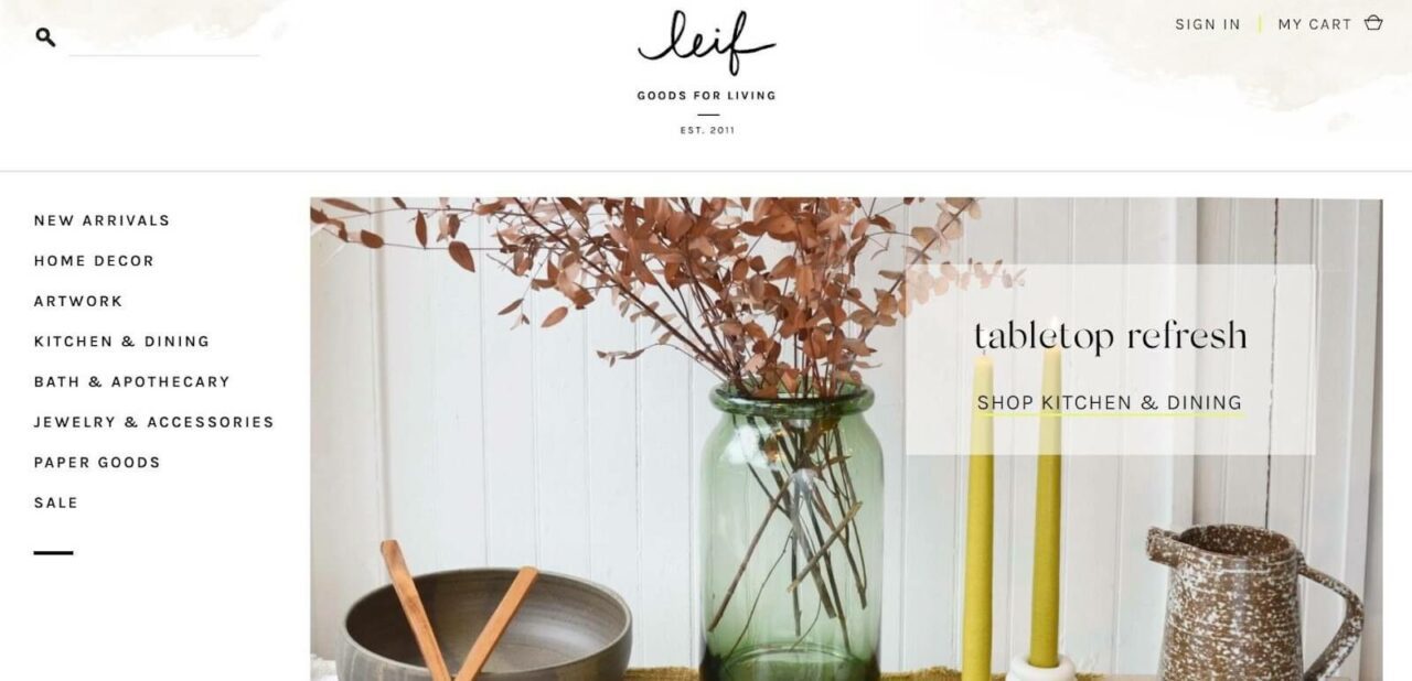
Colors can evoke specific feelings in the minds of your audience, so make sure the colors you choose communicate what you want visitors to feel. A great homepage must have a consistent color palette that blends well together and an attractive font that’s easy to read. Just like in this example from Leif:
Trust elements and social proof
Have you ever wanted to order something from an online store, visit a restaurant, stay at a hotel, or hire a service store, but you couldn’t find any reviews about them, so you took your business elsewhere? I mean, if no one can testify about them, how good, legitimate, or trustworthy can they be?
An ideal homepage inspires confidence in your visitors by leveraging other people’s experience with your brand through testimonials, reviews, and other social proof elements. Thus, consider it for your restaurant and ghost kitchen business homepage.
How to create a good homepage
Designing compelling homepages isn’t an exact science, so no one formula rules over them all. However, there are certain ingredients that need to be present when building a killer homepage.
Here’s how to create or redesign a homepage effectively:
Step 1. Find a homepage template
It doesn’t matter if you don’t have the technical skills to design your website from scratch or the money to afford a designer to build one for you. There are many business website builder options that offer a variety of templates, tools, and popups you can use for your homepage and other aspects of your site.
The trick to choosing a template that’s right for you is simply noting the purpose of your business website and the criteria that are most important to you. For instance, do you want your homepage to have a blog section, contact form, an online store, SEO and social media functions, or even direct visitors to a conversion-driven landing page?
You need to ensure the homepage template you choose will handle your present and future needs. If you’re unsure what you want on a homepage, you can always visit your competitors’ websites to see what they’ve done with theirs and let it inspire you.
Step 2. Craft an introduction for your business
When someone visits your site for the first time, you need to help them quickly determine what your business is about and who you are as a brand. Your homepage shouldn’t be a puzzle they have to unravel.
Add a statement, headline, or tagline that clearly defines who you are, what you do, and why you’re better than all the other options out there. This is the best way to get visitors acquainted with your business and make them feel confident enough to patronize you.
Imagine you were a customer coming across your homepage for the first time. What kind of information or imagery would resonate with you and make you want to explore the site further? Or submit your email address, download an app, or request a quote?
Once you figure this out and work it into your homepage design. You will be able to impress anyone who comes across your site.
Step 3. Add interactive elements and images
Just because you’re a business doesn’t mean your homepage can’t be lively and entertaining. Incorporating videos, illustrations, animations, images, and games into your homepage can make it more engaging and memorable to your visitors.
It can help them positively connect with your brand and improve their experience for the better. This will, in turn, boost your brand awareness, customer retention, and conversion rates because your audience will find your brand persuasive enough to keep returning and doing business with you.
What’s the best way to create images like the one used by Apps?

Rather than relying on Adobe Photoshop (which can be pretty pricey) to produce high-quality images and visuals for your homepage, try a photoshop alternative to accomplish the task cheaply.
Tip: One thing you need to be mindful of when using interactive elements is how they can affect your loading time. A fun, vibrant business website is excellent, but what’s even better is an engaging website that loads quickly (preferably in two seconds or less).
Step 4. Build hierarchy into your page
Hierarchy is one of the most valuable practices in homepage design. Without it, you’ll just have a confusing layout that doesn’t do a good job of communicating with visitors.
Using hierarchy in your design will help direct the experience and flow of information for your audience by arranging design elements according to their level of importance. They’ll be able to identify (without being explicitly told) which text to read first, what elements you want their eyes drawn to, and what action you want them to take next.
Your visual hierarchy should make it easy for users to browse through the content on your website, find the information they need, or complete whatever tasks they want to do as seamlessly as possible.
Step 5. Add CTAs
Whether it’s lead generation, product discovery, form submission, or giveaways, your homepage design would be incomplete without a few clear calls-to-action (CTAs) telling visitors what action to take. Without deliberate and compelling CTAs, they may just close your website and continue with their lives after viewing your homepage.
CTA prompts and buttons should be strategically placed throughout your homepage to avoid missing out on opportunities to promote your products and services, acquire new leads, nurture prospects, and drum up conversions.
Your CTA should be prominent enough to capture attention, but it shouldn’t take up the whole screen.
It also needs to communicate the value the user gains from taking the prescribed action. For example, instead of simply saying “get started now,” your CTA can say “get started to enjoy 60 days free.” Now there’s extra incentive for them to take that step.
There are many ways to introduce CTAs into your homepage. For instance, you can ask them to “shop now,” “get a demo,” “receive a quote,” or “find out more.” Or, if you want to link to a brand ambassador program or another exclusive program, try using symbols or images instead of words to spark curiosity and convey secrecy.
Small business website examples to take inspiration from
Now that you know what it takes to build a high-converting homepage, here are some small business websites that do a fantastic job of implementing these practices.
#1. Poetic
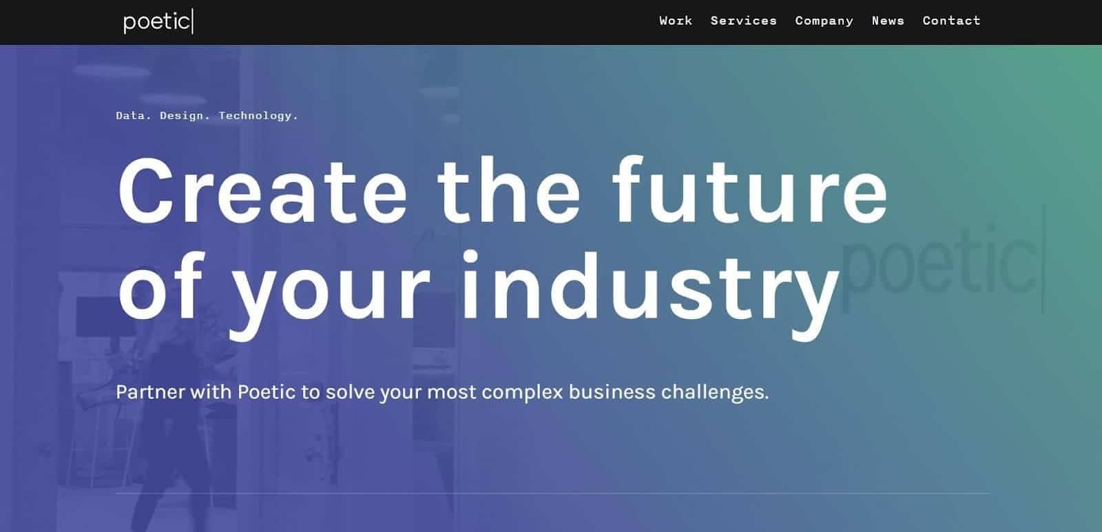
Why this homepage stands out:
- It has a powerful tagline that demands attention while explaining what the company does and how it can add value to the visitor’s life
- Each section of the page is rife with information about the company, its services, processes, and features
- Creative color combinations give the homepage an edge. This transforms a normally formal and serious topic into something exciting and poetic.
- It includes social proof elements such as examples of companies they’ve collaborated with, case studies of previous work they’ve done, and testimonials from satisfied clients
Pro tip: You can recreate the contrast that Poetic weaves into their visual design by using black and white design or pairing contrasting colors together for dramatic effect.
#2. Cleenland
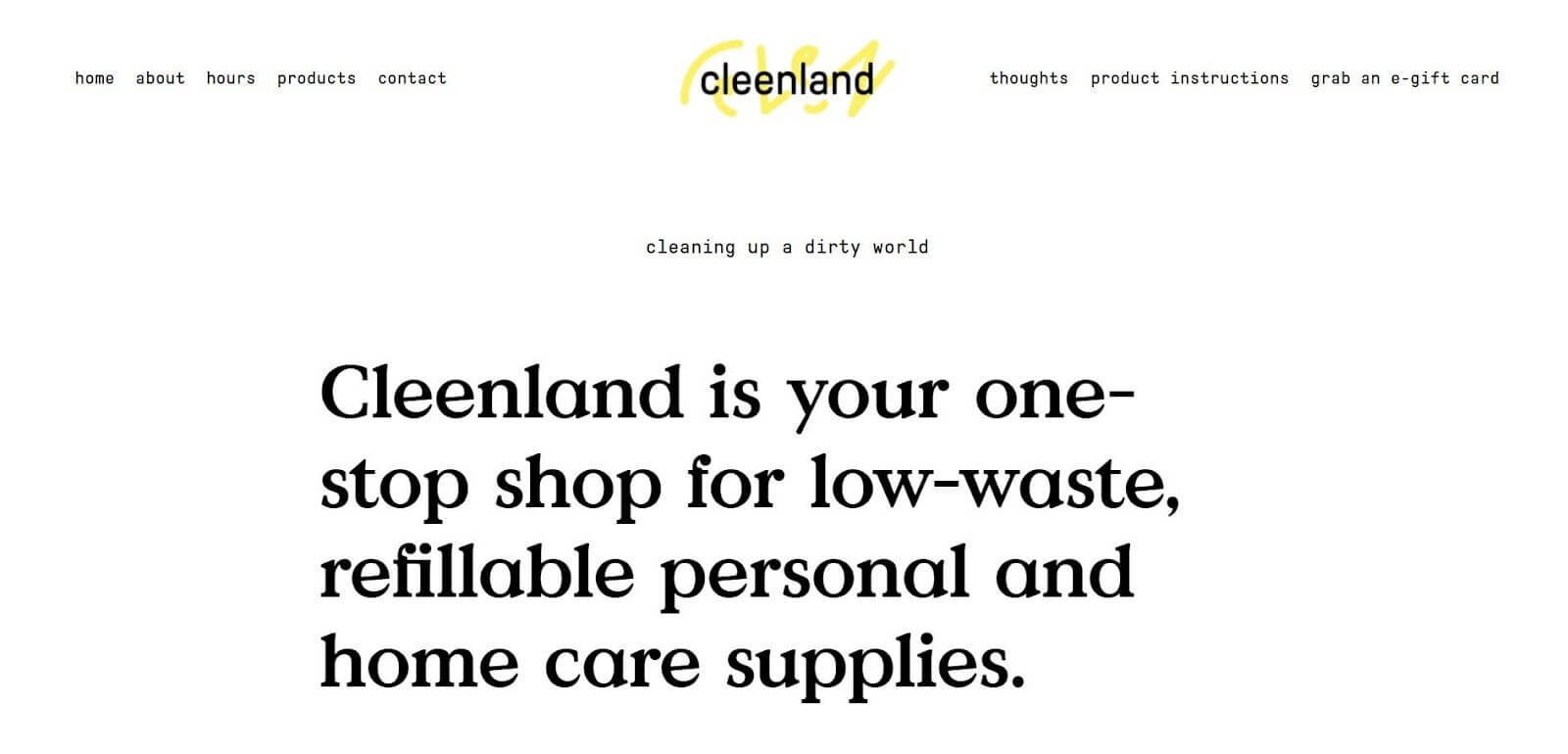
Why this homepage stands out:
- It has an introductory tagline to explain what the company does and its values in a bold, unmissable font
- It uses a clean, minimalist design that doesn’t overwhelm visitors with unnecessary information. This is consistent with the brand’s identity of being low-waste and efficient.
- It uses CTAs to demonstrate clear value. These are strategically placed at the top and bottom of the page.
- The website’s navigation is simple and user-friendly
#3. Wisr
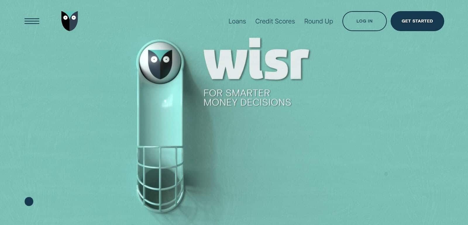
Why this homepage stands out:
- It uses vibrant, catchy colors paired with stylish fonts
- As you scroll down the page, the page highlights critical product features. Then, the color scheme changes, and you discover a new CTA. This adds an adventurous and enticing air to the design and flow of information.
- It has strong copy that goes into the right amount of detail, conveys value, and prompts you to learn more. This copy stays on topic and works to help visitors rather than sell to them.
- It combines animations and custom graphics to make the page more interactive and engaging
Pro tip: You can recreate the infographics Wisr uses with an online infographic creation tool.
#4. Panache

Why this homepage stands out:
- It has compelling and straightforward copy that delicately explains who Panache is, what it does, and why it’s the best option for visitors
- It uses a single page to tell an interesting story about the brand’s journey. This gives visitors a sense of quality work and sensory experience they can get from working with Panache.
- With the aid of bright and colorful animations and transitions, it turns scrolling into a unique and memorable experience that holds attention.
- It lists some of the companies the brand has worked with in the past. Some of these are well-known names, adding an extra layer of credibility and inspiring trust in potential clients.
#5. Patty and Bun
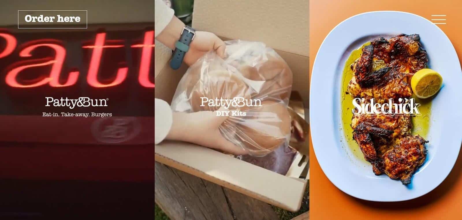
Why this homepage stands out:
- The page opens with a collage of videos tastefully stitched together to give you a sense of all the deliciousness the brand has to offer. You can’t help but spend several minutes staring at it.
- Some CTA buttons are aesthetically woven into the interactive nature of the page, while others are static and highlighted at the top and bottom of the page. This diversity makes them more impactful.
- The navigational options are cleverly tucked away in the unmissable menu button at the top that unravels when clicked. This introduces an exciting contrast to the page.
The trick to mastering small business website design
Your website is an opportunity to make a good impression and deliver a unique experience that site visitors won’t forget in a hurry.
It’s okay to think outside the box and bend the rules of web design to match your vision as long you don’t sacrifice your identity, user experience, and functionality in the process. Consider your target audience and tailor your homepage design to suit their tastes.
But above all else, work to hit the right notes and adjust your website based on visitor data and feedback. This will help you design an intuitive, engaging, and aesthetically pleasing homepage.
Author: Elise Moss is a SaaS content writer and helps brands create informative and innovative content. She’s worked with brands like Media Berry and ProProfs. When Elise isn’t busy writing, she’s out traveling the world and exploring new cultures. You can connect with Elise on LinkedIn.
Table of Contents
- Why you need a good homepage
- #1. To introduce potential customers to your business
- #2. To make sales
- What makes a homepage "great"
- It clearly describes your business
- Clean and creative design
- Positive user experience
- Pleasing fonts and colors
- Trust elements and social proof
- How to create a good homepage
- Step 1. Find a homepage template
- Step 2. Craft an introduction for your business
- Step 3. Add interactive elements and images
- Step 4. Build hierarchy into your page
- Step 5. Add CTAs
- Small business website examples to take inspiration from
- #1. Poetic
- #2. Cleenland
- #3. Wisr
- #4. Panache
- #5. Patty and Bun
- The trick to mastering small business website design
Related Posts
-
 Read Story
Since 2015, the number of marketers who consider video prospecting a vital element of their campaigns has risen to an incredible ...
-
 Read Story
There is no email marketer out there who thinks they have a big enough email list. No matter the industry we are trying to impact...
-
 Read Story
Learn what email trends will shape our industry in 2024 and how you can make more sales with your email marketing this year. W...
-
 Read Story
Are you looking for a job and planning to cold email the hiring manager? Email can be an effective way to establish a connection ...
-
 Read Story
Establishing a strong identity is vital for brands. Email branding can make a difference for your business and build trust with c...
-
 Read Story
How has email outreach changed during the lockdowns? Sergey Aliokhin, Community Outreach Manager at Visme, explores the topic and...