How to Optimize Your Email Signup Form – And Turn It Into A Lead Capture Machine
If you want to collect new subscribers for your mailing lists, email signup forms are the way to go.
Signup forms are often packed with different elements to increase their chances of success, but knowing what elements to use can be tricky.
Does the content matter more than the visual of the form?
How do you convince people to sign up rather than click away?
These are questions that require some expertise to answer.
We’ve got you covered and will share advice and tips that will help you take your email signup form game to new heights of success.
Before we get into that, though, let’s quickly discuss why email signup forms are important.
Why email signup forms are key in lead capturing
Lead generation can be a tedious task, but it’s a lot easier with strategies like email signup forms. Leads – people who show interest in your service or product – can be converted into customers if you build a good relationship with them.
Email signup forms can be the first step in that relationship as they help you capture and save relevant information effectively for future use. These signup forms are often created so they feel natural and make it easy for leads to give up the information you want from them.
Once a lead is captured, you can proceed to use the information they shared to get them excited about what you offer. Well-planned and crafted lead capture forms can become lead generation machines with great ROI.
Email signup forms can make capturing new leads easier, especially when you’ve planned and designed them cleverly.
7 ways to optimize your signup form
Now that you know why you need to use email signup forms, we’ll get into how you can make the most of them. Although you can use any of the following strategies, it’s most effective to use a combination of all of them.
#1. Give people an incentive to join
You must give people a valid reason to fill out your lead capture form. When your audience gives up the information you want, they expect something in return.
What is it that you’re offering? Does it stand out from the competition? Will it be worth your audience’s time? Does it set the customer up for success?
The incentive must be alluring, irresistible, and something your audience wants. Also, it has to be well-written and interesting.
Naturally, the incentive you use will depend on your audience. That’s why you must know the people you’re trying to get to sign up. In-depth personas will take you far here.
What are their pain points?
What do they want from the competition that you can offer?
What makes your offer special and unique?
Use questions like these to develop great incentives that will attract your audience and make them want more.
#2. Write value-focused copy
The wording of your email forms is another element that you can’t afford to neglect. Using the right phrases and words can make the difference between a somewhat successful email signup form and one that really captures leads.
Something as simple as changing from a generic headline like “Join our newsletter today” to a phrase with more promise such as “Sign up today and enjoy exclusive discounts” can be quite effective.
Another element that adds value to the copy of your signup forms is the button text. If you use action words along with a promise of some sort, your button will be more attractive. It’s the same principle as with the overall copy – your potential leads must know that there’s something in it for them if they sign up.
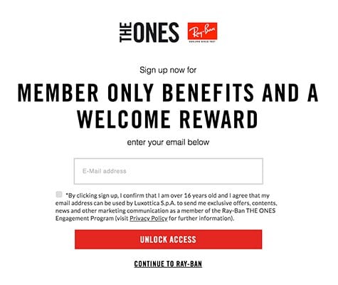
Consider, for example, Ray-Ban’s wording in the lead capture form below. Ray-Ban says “unlock access” over just “subscribe” and promises “member only benefits.”

But whatever you do, stay away from spam words. Rather than attract leads, these words will chase them away faster than a Las Vegas dry heat.
The colors you use and the style of your form are also important. Consistency is key to winning more leads, and your lead capture form must fit in well with the design of your website. Of course, it should still stand out and attract attention, so some creative planning and testing are called for here.
Your call-to-action (CTA) must be well-planned as well so that your leads feel they have to take action.
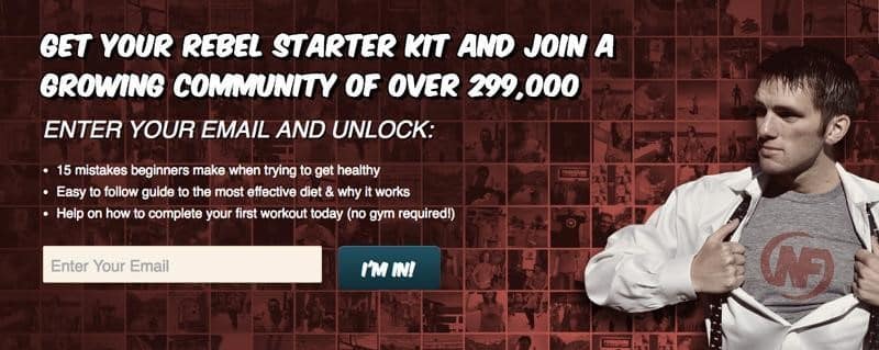
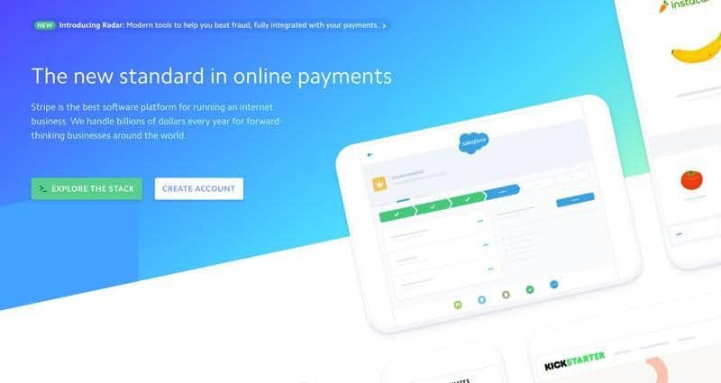
Here are a few call-to-action examples to inspire you:


#3. Offer social proof
Social proof plays a significant role in swaying people to buy a product or use a service. It is a powerful tool that can ensure better sales and brand loyalty. Consumers tend to do research before supporting a brand, and social proof is how they determine if the company is worth their time and money.
The most common forms of social proof are testimonials and customer reviews. Since 87% of consumers look at reviews online before making decisions, you really should show them what previous customers think and feel about your service or product.
Giving social proof in the signup form is clever because you don’t have to wait for people to research your brand; you give them the information they need right there. Of course, you can’t really include the customer reviews or testimonials in the form, but you can put them nearby on your company’s homepage for easy access.
#4. Give people multiple signup options
The placement of your email signup form also matters a lot. It can be very influential, so you must place it where people can easily see it.
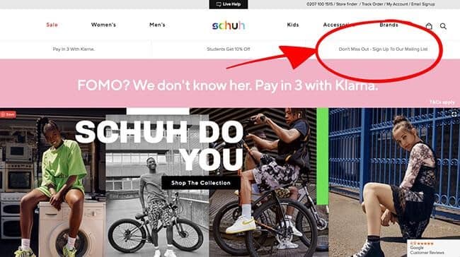
There are several places to put your forms: the bottom of the page, the sidebar, the header, your landing page and the About page. You can also consider integrating the form as a floating bar or underneath blog posts.
Give people more than one place to find your signup form, and you’ll have a better chance at getting results.
#5. Tailor the form’s length to your audience
Once again, knowing your audience is useful. The length of your email signup form depends on your audience’s preferences and overall characteristics. Some people won’t mind long forms with many fields. Others will be frustrated and won’t complete the form.
On the other hand, some people don’t like just handing over their information to everyone who shoves a form in their face.
Research what your audience is most comfortable with and take that into consideration. While longer forms will be better at generating more qualified leads, they might not be appropriate for your audience.
The intent and goal of your form will also play a role in its length. Short forms will be good enough if you want to collect email addresses and basic info. But, if you need more data to use for promotional purposes, you’ll achieve more with a longer form. You should also consider the customer journey when planning your email signup forms.
#6. Put your form above the fold and use pop-ups
A strategic and recommended place to integrate your email signup forms is above the fold. That way, your website visitors will see it before they start to scroll through your content.

The top of a web page is typically where the most engagement happens, so it only makes sense to put your form there. This is especially useful because not everyone who visits your page will scroll down.
Pop-ups can be great for lead capture forms because people notice them quickly. Also, visitors to your site have to face pop-ups and can’t just ignore them. (Just make sure your pop-ups aren’t annoying!)
You can also personalize pop-ups to make your website visitors feel more special. Using personalization can feel more friendly and decrease the likelihood that a pop-up will feel like a frustrating intrusion.
#7. Get creative with images, GIFs, and typography
Just because email signup forms are there to collect leads and information doesn’t mean you can’t be creative and make them look good. In fact, you should absolutely get creative.
A plain and simple signup form can work, but one that makes creative use of typography, images, and GIFs is more likely to keep your potential leads interested.
Although your content must be consistent, you can still play around with these elements. As long as the images and typography blend in well with the rest of your content (and your brand design), you can think outside the box as much as you want to.
It’s a good idea to keep an eye on things like typography trends that can attract your visitors with more success. Just be aware that trends move fast.
Tips for email signup form success
As you can see, there are many ways to enhance your email signup forms.
Now, the following tips will help increase the success rates of your forms. When coupled with the optimization strategies we shared, you’ll have a more well-rounded lead generation strategy with a higher chance of paying off.
Build email validation into your process
Email validation is something that many brands neglect because they don’t realize how important it is. This procedure verifies email addresses to ensure your emails are going to valid and deliverable addresses.
Elements like spam and bounces can negatively affect the success of your email signup strategies. Use an email validator for peace of mind. You’ll know that your efforts are not wasted.
You should also clean up your existing email lists in bulk and validate any new email addresses that sign up through your forms. If you use the right tool, you can do this verification through a real-time validation API, so you don’t have to worry about any of the technicalities.
Use A/B tests to guide your CTAs
It’s almost impossible to know if any of your ideas are paying off if you don’t conduct tests to determine your success rates. A/B tests are great, and you can use them on all your content, including your CTAs, signup forms, and copy.
These tests are really good at showing you which areas of your forms you should change and which ones work really well. With the data gained from A/B tests, you can determine how well your design works, which fields are vital, how many fields are good enough, and whether or not your CTA button text is compelling.
However, don’t rush in and test every single element in one A/B test, or you’ll get muddled results with no concrete conclusions. Instead, create multiple versions of your forms and test every element separately.
You should also try to get as much data as you can, so if possible, collect data from 100+ potential leads per variation of your form.
Consider form structure carefully
Another often-neglected element of email signup forms is the structure of the form fields. Your forms are useless if the information you’ve gathered isn’t neat or structured well. Having different spellings of words, birth dates that are formatted incorrectly, or invalid email addresses will mess up your data.
That is why it’s essential to plan the structure of your form really well. For this purpose, regex validation can be beneficial. This property can help you define a set of validation options for a field. That way, you can avoid mistakes and errors.
It’s also a good idea to use different types of fields in your forms. Drop-down menus are easy to use and are visitors often prefer them because they don’t have to type in any information.
Checkboxes are foolproof, as are some number-based text boxes. If creating a form by hand proves time-consuming, try using an online form builder to simplify the process.
Optimize your email signup form and maximize your lead generation efforts
Well-planned and optimized email signup forms are irreplaceable for anyone looking to improve their email marketing efforts.
As we’ve shown here, there are several ways to make sure your forms are geared towards efficiency. By incorporating these tips and pieces of advice into your efforts, you can increase your rate of success.
But, of course, remember to run tests until you find the perfect signup form for your unique audience!
Author: Elise Moss is a SaaS content writer and helps brands create informative and innovative content. She’s worked with brands like Media Berry, ProProfs and others. When Elise isn’t busy writing, she’s out traveling the world and exploring new cultures. You can connect with Elise via LinkedIn.
Table of Contents
- Why email signup forms are key in lead capturing
- 7 ways to optimize your signup form
- #1. Give people an incentive to join
- #2. Write value-focused copy
- #3. Offer social proof
- #4. Give people multiple signup options
- #5. Tailor the form’s length to your audience
- #6. Put your form above the fold and use pop-ups
- #7. Get creative with images, GIFs, and typography
- Tips for email signup form success
- Build email validation into your process
- Use A/B tests to guide your CTAs
- Consider form structure carefully
- Optimize your email signup form and maximize your lead generation efforts


