
The 5 Must-Haves of a Successful Ecommerce Site in 2024
Struggling to get your ecommerce site off the ground? Here are five must-haves to engage, delight, and retain your customers.
The world of ecommerce is growing quickly and steadily. If you own an ecommerce business, your website is a key element of your sales potential and, of course, of your business’ success.
In other words, your ecommerce site is the new go-to platform that’s replacing the old brick-and-mortar store. In fact, Statista data forecasts that by 2027, the online segment will represent up to a quarter of total global retail sales.
If you aim to build a successful ecommerce website or are thinking of revamping an existing one, consider these must-haves that’ll help grow your conversions.
What does a successful ecommerce site look like in 2024?
Think of the very best websites you know. What do they have in common? Of course, each niche is a whole different world, but you should take inspiration from your internet heroes.
What do you want your visitors to experience? If it was you, what would you love to see?
Each business is different, and so there is no one-size-fits-all formula for building a successful e-commerce site.
In 2024, a winning ecommerce site could look like a simple landing page with just the basics, especially if you sell just a few categories of items. But keep in mind that this varies widely depending on the size of the business and its goals, among other things. Hence choosing the right ecommerce platform can make all the difference
Five things your ecommerce site should have in 2024
Considering that success looks different for each e-commerce site, let’s review the must-haves from which every site can benefit to grow and engage customers in 2024.
#1. Catchy landing pages
The purpose of a landing page is to get your visitors to do something, whether it’s signing up for your newsletter, adding a product to their cart, or buying your rockstar products.
In landing pages, as in life, less can be more. Don’t overwhelm your customers with unnecessary text, too many images, or random buttons. Focus on writing relevant copy and using high-quality media.
The most important thing is to make sure every single link and icon works as expected. There’s nothing worse than browsing through a website and realizing the links are broken or not even meant to actually work (lorem ipsum rings a bell?).
Another aspect to keep an eye on is the file size of the images and videos you add, and the site speed overall. Consider making use of next gen image formats which deliver better compression but have higher quality than traditional image formats.
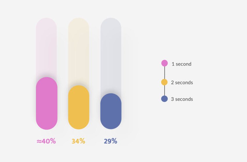
According to Portent, a shorter loading time means a higher conversion rate. On average, when pages load in just one second, the conversion almost reaches 40%. In two seconds, the conversion rate drops to 34%. At three, it’s 29%. And so on.
The core elements of a great landing page include:
- A hero section with the product or service features and benefits
- Information about you or your business
- Testimonials from customers
- Safety guarantees
- And most importantly, a call to action
Buy a top-notch landing page template that suits your business needs and get help from professional designers. Templates do most of the work for you. All you have to worry about is adding your own content, colors, and media.
#2. Mobile-first optimization
Most users nowadays will visit your website from a mobile device. Semrush found that, in 2023, there were 313% more mobile visits than desktop visits. Hotjar shared that, at 68%, mobile traffic accounts for more than two-thirds of all ecommerce sessions.
While visitors spent 37.7% longer per visit via desktop than mobile, sometimes their first impression will come from your mobile site. Maybe they’ll find you from a social media ad or a quick online search on the go.
If they like what they see, they’ll save the link and visit later from the comfort of their desktop — or at least that’s the ideal scenario.
Of course, you should also assume users will browse and buy from their mobile devices. If you don’t do that, that’s where the problem begins for some customers: according to Hotjar, the mobile cart abandonment rate is the highest compared to desktop and tablets, at 85.65%.
I firmly believe that responsiveness is the best retention marketing strategy. A great website looks good and works seamlessly on every device.
#3. A carefully crafted email strategy
Adding email forms is a great way to ensure your customers are willing to stay in touch. But for them to make that decision, both the form and the newsletter should be eye-catching.
As you can learn from one of ZeroBounce’s previous articles – where you can also find many great newsletter signup form examples – newsletters should aim to inform and nurture your audience. It’s a softer, more organic tactic to bring the customers back to your site and motivate them to make a purchase.
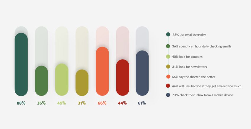
ZeroBounce surveyed 657 people on four continents, and here are my favorite insights:
- 88% said they use email daily, with 36% stating they spend less than an hour daily checking their inboxes.
- 40% of the users said they check their emails looking for coupons, and 31% said they do it to look at newsletters.
- 66% said the shorter the email is, the better.
- 44% will unsubscribe from an email list if the sender emails them too much.
- 61% check their inbox from a mobile device.
With that in mind, these are my takeaways to consider when designing a newsletter:
- Your customers are likely to check their inboxes daily, so an email strategy is still relevant in 2024. Don’t underestimate its impact!
- Don’t write too much or too often, but be consistent. This way, you won’t take too much of the user’s time, you won’t bore or annoy them, and you will stay top of mind.
- You can always spoil your customers with exclusive offers. This will give them a reason to keep opening your emails.
- Share relevant industry news and how your business benefits from them.
- Just like your landing pages, your emails should be mobile-friendly. Make sure everything loads and looks perfect on every device.
- If you don’t know how to add email forms in HTML, don’t stress about it and use a pre-designed template. These often have great designs and are responsive.
As a bonus tip, consider sending cart abandonment reminders via email. It happens to the best of us: we buy something but decide to think it through before spending our valuable money. According to Hotjar, cart abandonment emails have a 39.07% open rate and a 23.33% click-through rate.
#4. Eye to detail in the user experience
I don’t know about you, but I love it when I visit a website that provides a unique user experience.
One site that I really like in this matter is Ben & Frank’s, a Mexican eyewear store with a brilliant branding and marketing strategy. You can see interactive images of their glasses to check them out from every angle. They even provide Instagram filters where you can try them to see how they would look on you.
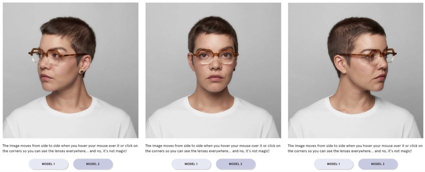

Source: Ben & Frank website / Ben & Frank Instagram account
While your website is your basecamp, hub, and temple (okay, you get the point), your users may enjoy joining you on social media. But ultimately, they should be eager to visit your site and make a purchase.
A great idea for linking your social media with your e-commerce site is organizing dynamics for your customers. Why not try hosting live Q&A sessions with industry experts covering a topic that may interest your customers?
Let’s say you own a fitness clothing e-commerce site. How about getting a professional athlete to talk about their sport? It’s also a good marketing strategy to offer them freebies from your brand and have them talk about why they like to use your products.
You can also make sure your loyal customers don’t miss these dynamics by providing an add-to-calendar link on your website or via email.
#5. Great customer service
We should think about how we like to keep in touch with certain businesses. What support options do we actually like to use? What kind of assistance do we appreciate the most? Get the answer to these questions. You must provide the best possible support for your customers.
Asking for help should be easy. Answers should also be helpful, specific, and quick.
Configure a mobile-friendly, top-notch chatbot that is truly useful to tackle common questions your customers may have.
Live support is also great. According to Userlike’s research, at least 60% of respondents said they would prefer to wait in a queue to speak with a human agent immediately. However, 68% of respondents liked that chatbots answered quickly.
Being able to get prompt help from any inquiry is always a great tactic to keep your customers from leaving.
Most importantly: observe, learn, and execute
There are many tools, tips, and techniques for improving your e-commerce site. Ultimately, the most important thing is to listen to your customers.
Observe what others are doing right, what your users’ pain points are, and what they need. Learn about your market, your niche, and even your own product.
Keep studying the ground, and once you understand what you need to do, start from there. Work on your site and build its most useful, attractive, and unique version. This is an ongoing process, with an ever-changing market. You can always keep on growing.
Author: Renata Martín is a staff writer on the Envato Tuts+ team. She’s passionate about film, streaming, sports, and the outdoors. You can find her reading several unfinished books at the same time!
Table of Contents
- What does a successful ecommerce site look like in 2024?
- Five things your ecommerce site should have in 2024
- #1. Catchy landing pages
- #2. Mobile-first optimization
- #3. A carefully crafted email strategy
- With that in mind, these are my takeaways to consider when designing a newsletter:
- #4. Eye to detail in the user experience
- #5. Great customer service
Related Posts
-
 Read Story
There’s a famous quote from Ernest Hemingway that says: “There is nothing to writing. All you do is sit down at a typewriter ...
-
 Read Story
If you have an Instagram account, you are one of the 1 billion monthly users of the photo and video sharing app. The company anno...
-
 Read Story
Do you feel like keeping your email inbox clean is a losing battle? To give you a hand, content marketing strategist Zoe Devitto ...
-
 Read Story
There are many cold email marketing agencies out there, but how do you pick the right one? In this guide, Belkins CMO Margaret Le...
-
 Read Story
If you want to collect new subscribers for your mailing lists, email signup forms are the way to go. Signup forms are of...
-
 Read Story
“Marketing is the activity, set of institutions, and processes for creating, communicating, delivering, and exchanging offering...